I don't mean to suggest that all PaperJacks covers were awful, but they did so often hurt the eyes. Consider the above, a detail from The Sixth of December, the subject of last Thursday's post.
Look away.
By far the worst cover PaperJacks ever produced was for Robert Kroetsch's The Words of My Roaring. One of their more attractive, it was ruined when the designer forgot to include Kroetsch's name.
The solution? Nasty-looking labels that look to have been cut and pasted by elementary school students. Here's another copy from Olman's Fifty.
One wonders when the folks at PaperJacks noticed? There are plenty of copies out there that have no trace of the offending label – and believe me, it would take an expert in paper conservation to remove that thing.
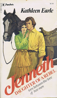
Competent, if uninspired, the cover for Kathleen Earle's Jenneth, Daughter of a Rebel is ruined by the pitch. Poor girl, "torn between the love of two men"... one of whom is a horse.
I've never known quite what to make of the quivering, friendly and freakish figure that graces the cover of Alan Fry's The Revenge of Annie Charlie.
Published in 1975, John Ballem's dark The Dirty Scenerio looks for all the world like a National Firearms Association annual report as designed by a poor man's Peter Max.
But for sheer awfulness, not one can hold a candle – or any similarly shaped object – to Marian Engel's phallus cover.
I call it One-Way Meat.
Related link:


Is Annie Charlie really quivering? Or is the jagged yellow outline something more sinister? I think she's lying in the snow, and someone has pissed her outline. That's why she wants REVENGE, natch.
ReplyDeleteI think the cover where they forgot the author's name is the coolest thing I've seen in months.
Oh, dear, that yellow on white does look familiar. I note that current publisher Harbour chose to go with a new cover.
DeleteWow. These are pretty dreadful. And all for different reasons.
ReplyDeleteIt's almost as if they learned their mistakes, but always found new, entirely different ways to botch things up.
DeleteThey were competing with the classy Canadian lit paperbacks that all looked like rorchach tests or the light show at a Canned Heat concert. Because if there's on thing we learned Gabrielle Roy, it's "acid is groovy."
ReplyDeleteWell, she did write a book called The Road Past Altamont.
DeleteAn internet game I would play, if Bookshelf set it up:
ReplyDeleteA series of Paperjacks' quality illustrations and the reader has to guess:
Canadian or Christian?
Annie Charlie is deeply disturbing in so many ways and has an 'outsider art' quality about it, but I think the Kroetsch label is a clear winner.
ReplyDeleteNo two covers the same. Tempting, aren't they?
DeleteBut then there is A Privilege and a Pleasure by Max Braithwaite, a 1975 Paperjack. I don't know how that was ever displayed in a bookstore at that time.
ReplyDeleteBraithwaite's A Privilege and a Pleasure looks like something that might've been published by Bee-Line or some other porn house of the 'seventies. False advertising - those who purchased the book based on the cover must have felt mislead. But how would one have justified returning it?
DeleteI guess over the years I have just ignored the covers and focused on Paperjacks that I thought I needed for some reason. Most are probably boxed in my garage. Now I will pay more attention when I spot them at hospital and library sales where they often turn up. I have that Alan Fry book in hardcover somewhere and have to ask myself why I would be holding on to it.
ReplyDeleteIf memory serves, the first of The Revenge of Annie Charlie features a nondescript image of the Rockies on its cover - good for Andy Russell, Paul St. Pierre, Aritha Van Herk and Janette Oke.
DeleteDamn you!...Now I'm going to be looking for Paperjacks paperbacks, without even caring what the book is about!
ReplyDelete